Cross-Correlation Model
- IT Support
- Snakehead
- e0031959 (Unlicensed)
Return to Overview
About
The Cross-Correlation model allows the user to plot 2 time-varying series alongside each other on the same graph, with the position and scaling of each series adjusted to provide the best possible mutual fit. It is used to visualise the degree of similarity between the two series, hence highlighting any potential relationships, as well as to measure their relative displacement across time periods. A correlation coefficient is also calculated to quantify the strength of the correlation.
This model is useful for:
- Determining whether one product is under- or over-valued relative to one another (or a benchmark),
- Comparing trends between two variables of interest (they need not be of the same category or unit),
- Determining if one time series is a leading indicator of the other.
Navigation
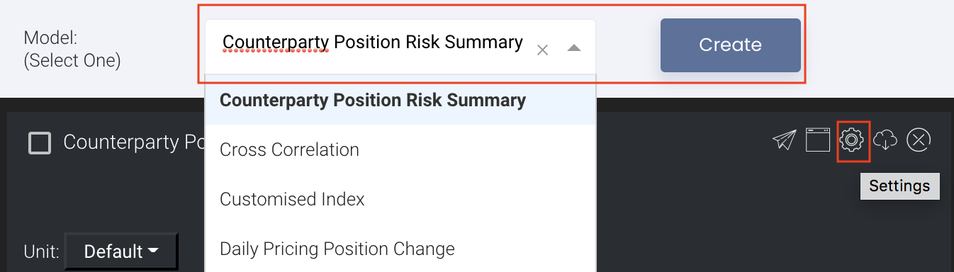
To access the quantitative model/report, click on 'Dashboard' from the navigation sidebar on the left.

Select the model/report from the drop-down list and click 'Create'. Click on the 'Settings' button (gear icon) at the top right corner of the model to set up your model/report.
Sharing Model/Report/Dashboard
To share the model with your group members, click on the "Share" button next to the Title of the model followed by the email address of the group members you want to share it with. Once submitted, the model will appear in the Dashboard>Group Dashboard of the selected group members.

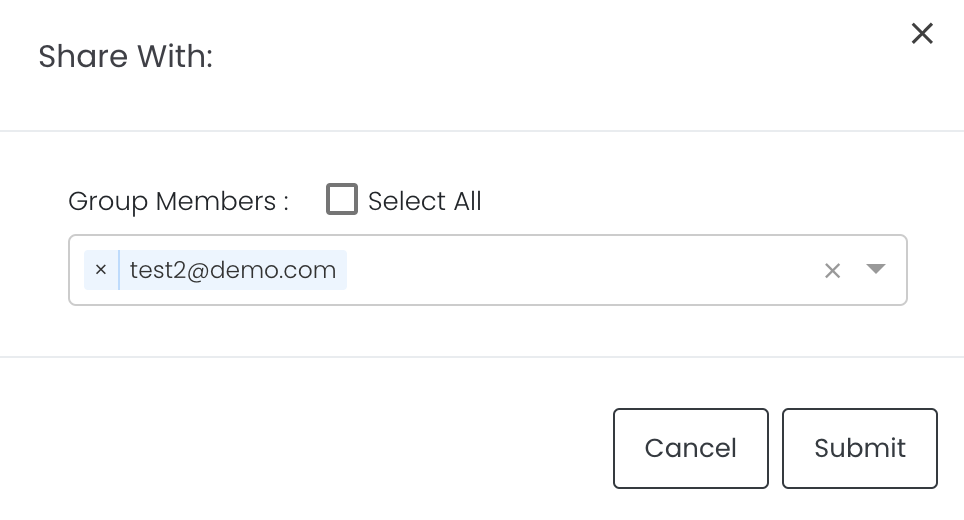
This is different from sharing individual or entire Dashboard models/reports, which allows any user who may or may not be users of MAF Cloud to access the individual model/entire dashboard via the shared web link (link will expire in 8 hours). In Group Dashboard, only group members can access the shared models/reports.
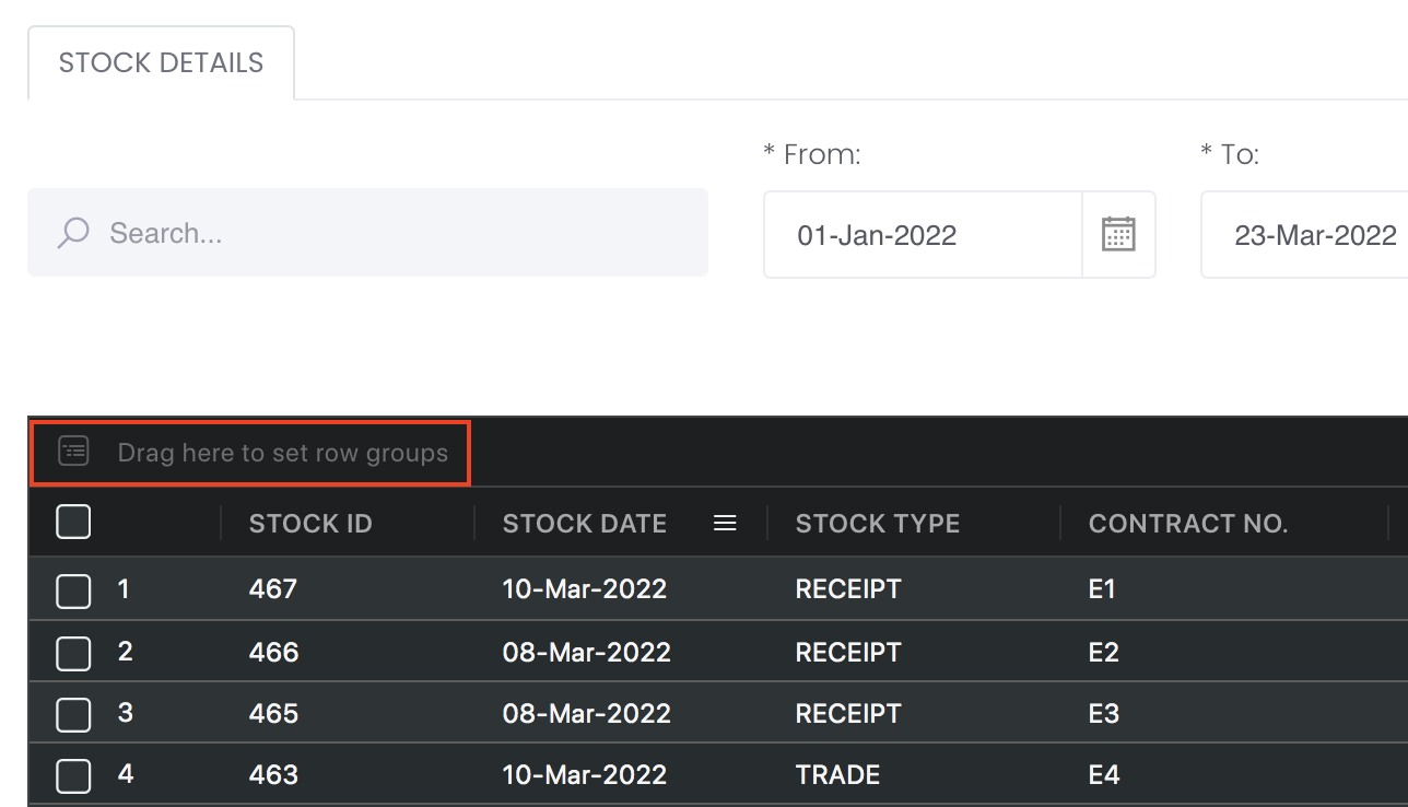
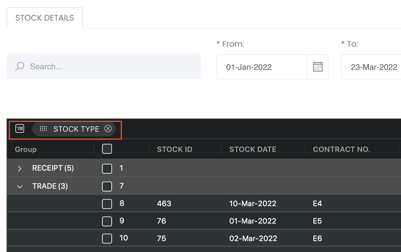
Group Rows
You may also group the rows (liken to the pivot table function in Microsoft Excel) to view the grouped data by dragging any column headers into the “row groups” section as highlighted:
Guide
| Name | Image/Description |
|---|---|
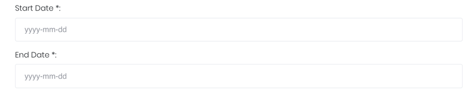
| Duration |
Select the start and end date of the time series. |
| Products |
Input product(s) of interest under 'Product'. If it is a future continuous contract, tick checkbox 'CONT' and fill in the 'Serial No.'. For more information, please refer to Futures Continuous Contract Data Setting. Otherwise, select the 'Contract Month' and 'Contract Year' for the product(s) of interest. |
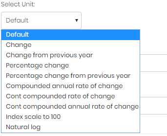
| Select unit |
Select the unit for the product. You may leave it as "Default". For more information about other units, please refer to Select Unit (Data Transformation Tool). |
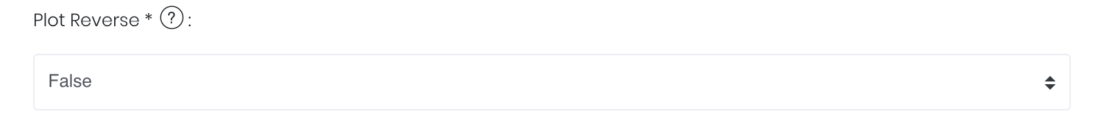
Plot Reverse |
True: There might be an inverse relationship between the 2 variables. The 'Plot Reverse' function will reverse the y-axis for the second variable to show the inverse relationship more clearly. False: Used if there is a direct relationship between the variables; the 'Plot Reverse' function will be disabled. |
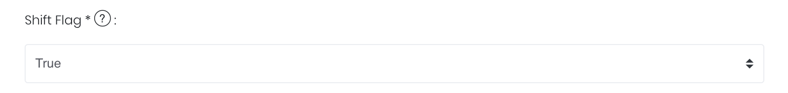
| Shift Flag |
True: One variable might be a leading indicator of the other – ie. the trend of one series is similar to and precedes (and possibly predicts for) the other with a certain time lag. Enabling the 'Shifting Flag' function will shift one time-series against the other to optimise the correlation coefficient, allowing their mutual relationship to be shown more clearly. The extent of the time-shift is indicated. False: The variables will be plotted against a common timeline; the 'Shift Flag' function will be disabled. |
| Comments |
The inserted comments will be displayed at the bottom of the application. This can be useful for documentation purposes or for settings description. |


Input
| Name | Description | Type | Example |
|---|---|---|---|
| Start Date | Start of products' cross-correlation. | Date (YYYY-MM-DD) | 2015-06-01 |
| End Date | End of products' cross-correlation. | Date (YYYY-MM-DD) | 2019-06-14 |
| Product(s) | Products of interest. | Product Name | ICE Gas Oil LS, Crude Oil Brent |
| Contract month. | Month | December | |
| Contract year. | Year | 2019 | |
| Continuous contract (for more information, please refer to Futures Continuous Contract Data Setting). | Checkbox | - | |
| Serial number of starting futures contract (for more information, please refer to Futures Continuous Contract Data Setting). | Numerical Value | 1 | |
| Unit (for more information, please refer to Select Unit (Data Transformation Tool)). | Unit | Default | |
| Plot Reverse Flag | Enable/Disable Plot Reverse function. | True/False | False |
| Shift Flag | Enable/Disable Shift Flag function. | True/False | False |
| Comments | Useful for documentation purposes or for settings description. | Text | - |
Output
Name | Description | Type |
|---|---|---|
| Graph | Each selected product will be shown as a time-series of a different colour. The legend indicating the product and its colour will be displayed at the top of each Y-axis. | Plot |
| Left Y-axis | First selected product's Y-axis would be on the left, with its range shown. | Plot |
| Right Y-axis | Second selected product's Y-axis would be on the right, with its range shown. | Plot |
Example


The prices of Low Sulphur Gasoil and Brent Crude Oil on the Intercontinental Exchange follow each other very closely, with a strong positive correlation of 99.06%.
Real-world Examples using the Cross-Correlation Model:
- [Insights] Gold vs Tips
[Insights] Are Oil Prices Following The Breakeven Inflation Rate?
[Insights] Do Stock Prices Really Go Down When Bond Prices Go Up?
Functionality
Displayed below are some noteworthy user interactions you can find on this application.
Name | Description | Interaction |
|---|---|---|
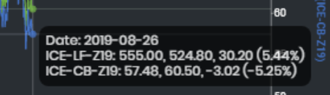
| Multi Tooltip Lines (Vertical and Horizontal) |
Mouse-over the graph and circle(s) will appear on the various time-series point(s) with a tooltip that displays the X-axis value ('Date') along with all the values on the Y-axis. The displayed values for each row are as follows (in order): 1st value: The value of the primary product. 2nd value: The fitted value of the other product, using the primary product as benchmark. (eg. The value of ICE-CB-Z19 when fitted against ICE-LF-Z19's Y-axis is 524.80, while vice versa it is 60.50) 3rd value: The over-valuation of the primary product relative to the other product, according to its own Y-axis. (eg. ICE-LF-Z19 is 30.20 more expensive than the fitted value of ICE-CB-Z19, while ICE-CB-Z19 is 3.02 cheaper than the fitted value of ICE-LF-Z19) Percentage: The over-valuation of the primary product relative to the other product as a percentage, where value of primary product = 100%. (eg. ICE-LF-Z19 is 5.44% more expensive than the fitted value of ICE-CB-Z1, while vice versa it is -5.25%) | Plot Element |
Click to access: