Regression Model
- IT Support
- Snakehead
- e0031959 (Unlicensed)
Return to Overview
About
The Regression model plots the price of one product against another, with the points plotted to be the respective prices of each product at each point in time in the duration selected.
Regression analysis can be used to study whether the movements of two products are correlated (ie. if they tend to move together or in opposite directions), and measure how responsive the change in the price of one product is relative to the other. The line of best fit equation, as well as the strength of correlation (both R-squared and adjusted R-squared), are displayed.
Additionally, the products' recent price movements in the past few days are displayed as a curve in the plot, while density of data points is also shown as bar charts along the axes.
Navigation
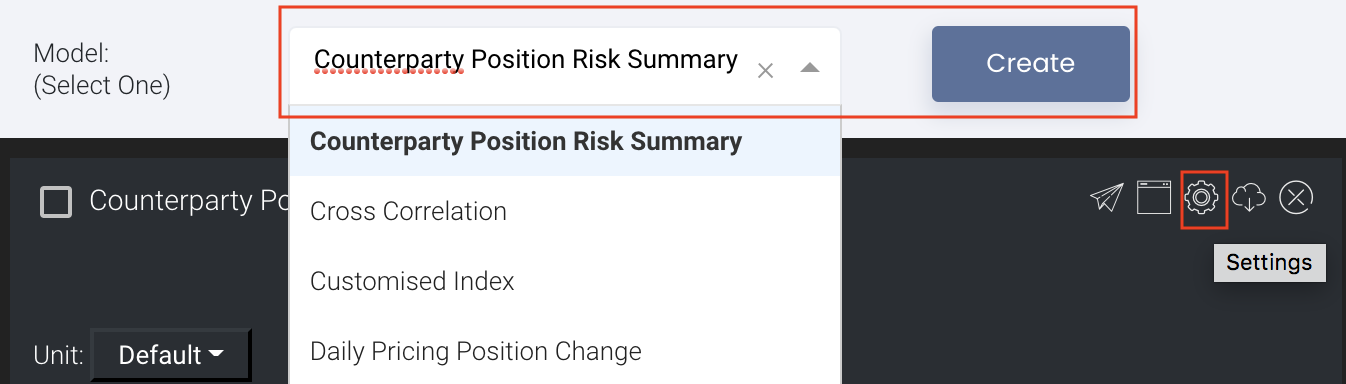
To access the quantitative model/report, click on 'Dashboard' from the navigation sidebar on the left.

Select the model/report from the drop-down list and click 'Create'. Click on the 'Settings' button (gear icon) at the top right corner of the model to set up your model/report.
Sharing Model/Report/Dashboard
To share the model with your group members, click on the "Share" button next to the Title of the model followed by the email address of the group members you want to share it with. Once submitted, the model will appear in the Dashboard>Group Dashboard of the selected group members.

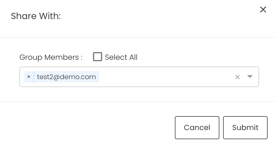
This is different from sharing individual or entire Dashboard models/reports, which allows any user who may or may not be users of MAF Cloud to access the individual model/entire dashboard via the shared web link (link will expire in 8 hours). In Group Dashboard, only group members can access the shared models/reports.
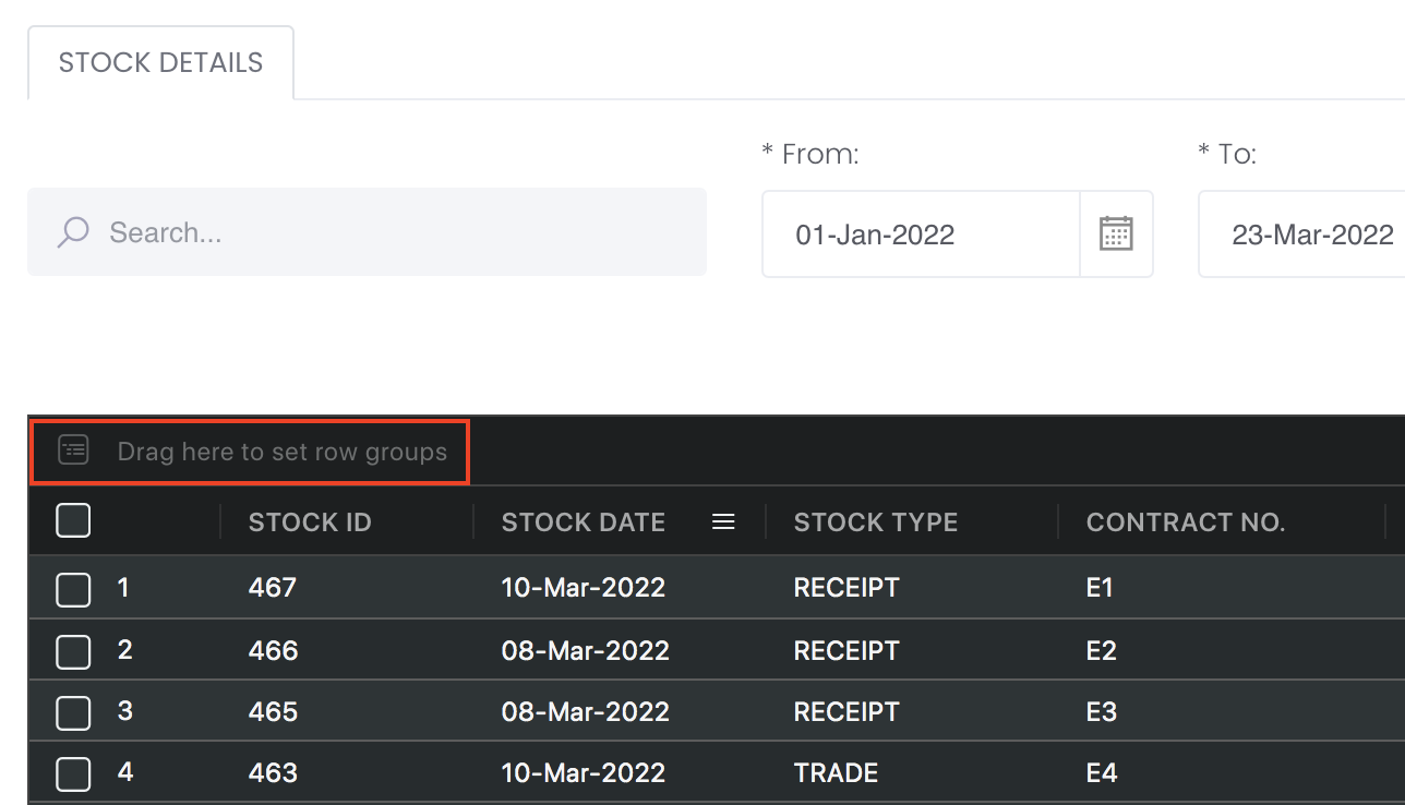
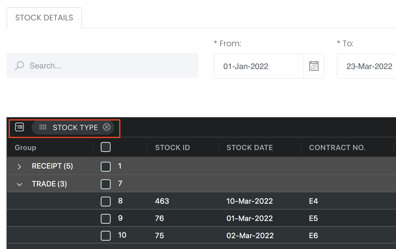
Group Rows
You may also group the rows (liken to the pivot table function in Microsoft Excel) to view the grouped data by dragging any column headers into the “row groups” section as highlighted:
Guide
| Name | Image/Description |
|---|---|
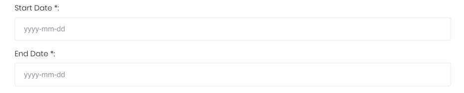
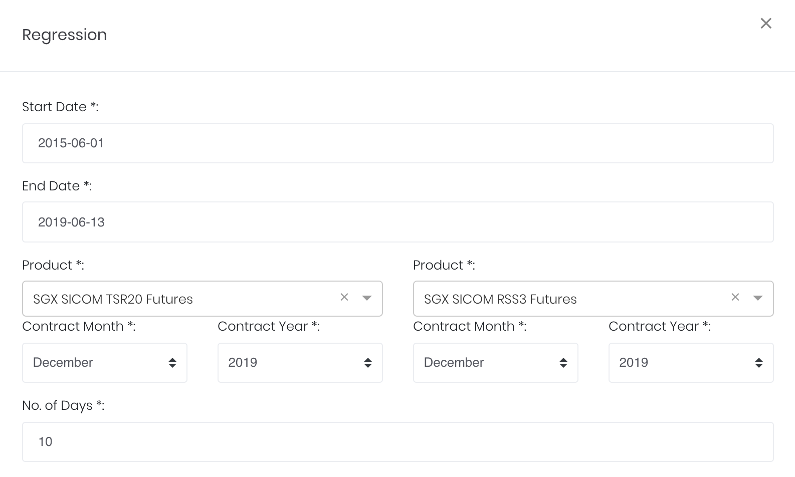
| Duration |
Select start and end date for the period of analysis. |
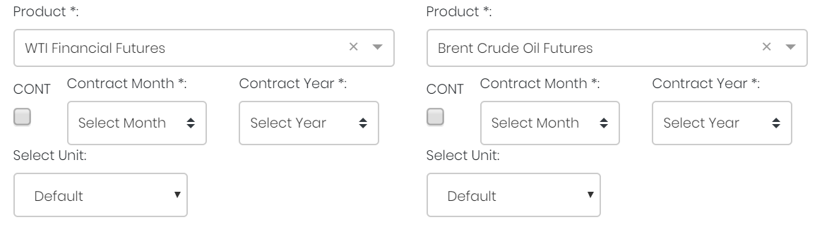
Products |
Input product(s) of interest under 'Product'. If it is a future continuous contract, tick checkbox 'CONT' and fill in the 'Serial No.'. For more information, please refer to Future Continuous Contracts. Otherwise, fill in the 'Contract Month' and 'Contract Year'. |
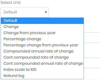
| Select Unit |
Select the unit for the product. You may leave it as "Default". For more information about other units, please refer to Select Unit (Data Transformation Tool). |
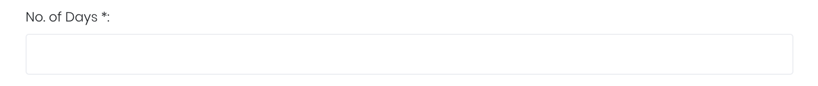
| Days |
Number of days for which the products' latest price movements are shown. |
| Comments |
The inserted comments will be displayed at the bottom of the application. This can be useful for documentation purposes or for settings description. |
Input
| Name | Description | Type | Example |
|---|---|---|---|
| Start Date | Start date of period for analysis. | Date (YYYY-MM-DD) | 2015-06-01 |
| End Date | End date of period for analysis. | Date (YYYY-MM-DD) | 2019-06-14 |
| Product(s) | Products of interest. | Product (Selection) | ICE Gas Oil LS, Crude Oil Brent |
| Contract month. | Month | December | |
| Contract year. | Year | 2019 | |
| Continuous contract (for more information, please refer to Future Continuous Contracts). | Checkbox | - | |
| Serial number of starting futures contract (for more information, please refer to Future Continuous Contracts). | Numerical Value | 1 | |
| Unit (for more information, please refer to Select Unit (Data Transformation Tool)). | Unit | Default | |
| Days | Number of days to view the latest price movement. | Number | 10 |
| Comments | Useful for documentation purposes or for settings description. | Text | - |
Output
Name | Description | Type |
|---|---|---|
| Regression Plot | Scatter-plot of prices of one product against the other. Each point represents the prices of the 2 products at a given point in time. Product codes and their respective unit ranges are shown on each axis. Line of best fit is a green line cutting across the plot, and its 95% confidence interval is coloured grey. | Plot |
| Recent Movement Curve | The points representing the latest price pairs are connected (in chronological order) into a curve, to show the latest movements of the product prices. Most recent point is highlighted in orange. | Plot Element |
| Density Chart | The density of data points (for each axis) is shown as bar charts along the axes. This allows the user to visualise the price distribution of both products. | Bar chart |
| Statistics | Significant regression statistics displayed are: R, R-squared, adjusted R-squared, and line of best fit. | Text |
Example
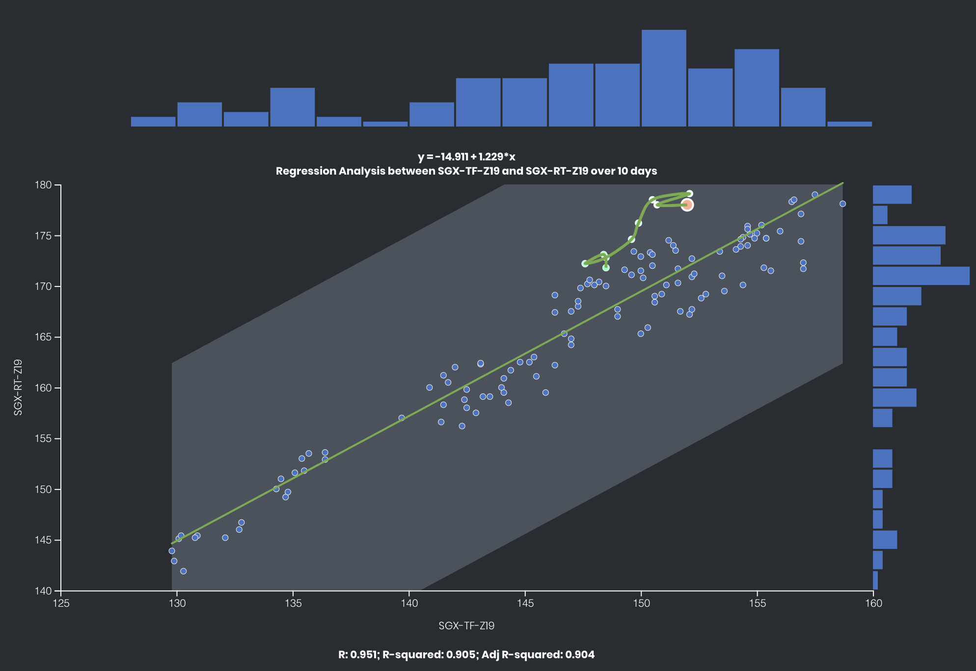
The prices of 2 Rubber futures traded on SGX – RSS3 (RT) and TSR20 (TF) – have a high but imperfect correlation with each other. (R=0.951)
Click to access: