Forward Curve Model
- IT Support
- e0031959 (Unlicensed)
- Christabel Chiang (Unlicensed)
Return to Overview
About
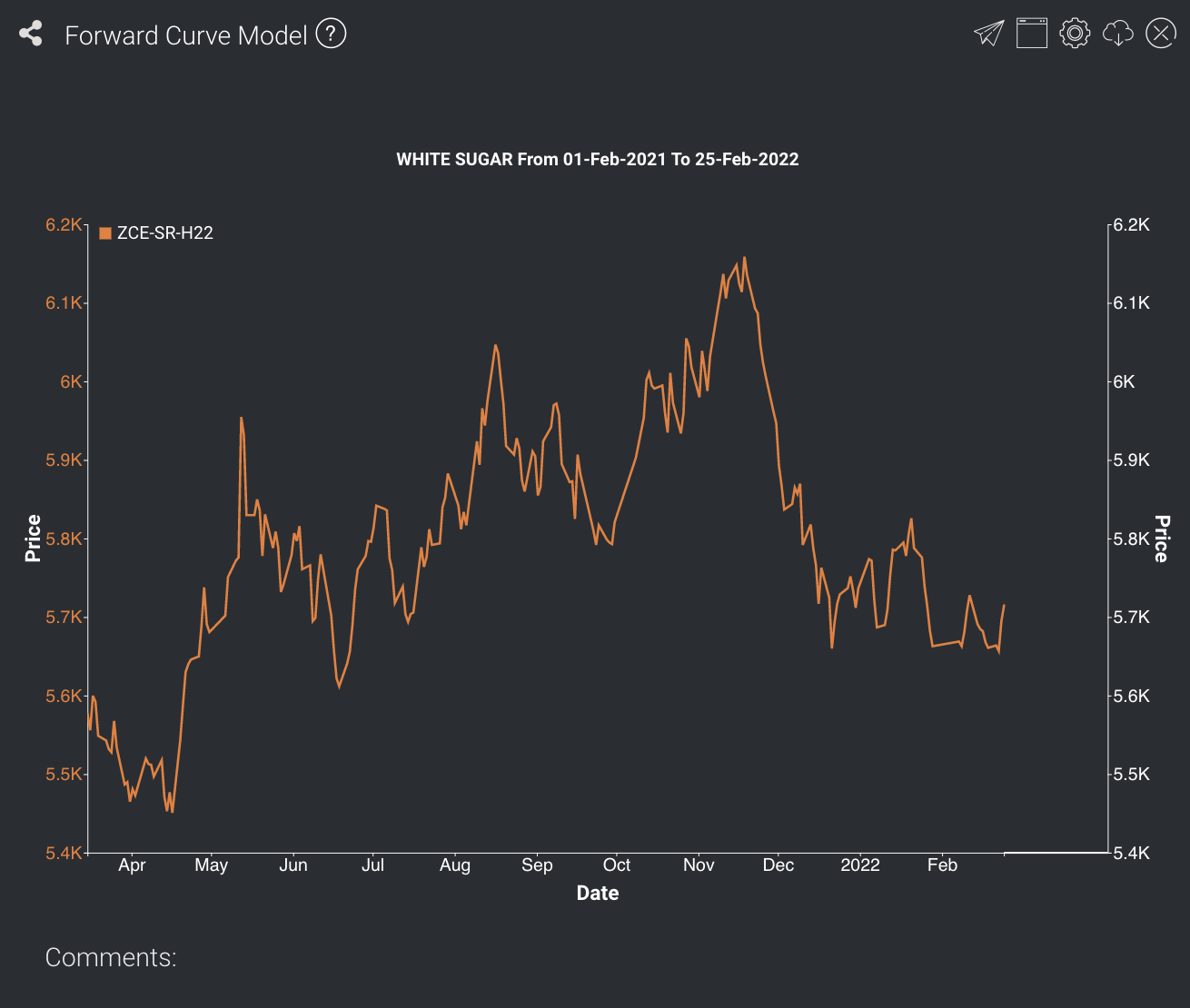
The forward curve is a graphical representation of how the prices of a product's forward contracts vary with their time to maturity.
In this model, there are two parts to the output graph: the historical spot prices of the product, as well as prices of forward contracts for the various maturities (ie. the forward curves) for the most recent trading days. Each forward curve starts from the spot price for that day and ends at settlement price of the contract furthest from that date. The user can select the number of forward curves to be shown – the latest curve would be shown in bold, along with the curves from previous trading days.
The model can be used for:
- Showing whether a product is in contango or backwardation,
- Viewing recent changes in the forward curve,
- Comparing spot and forward prices.
Note: The spot and forward curves may not be of the same scale – if duration selected is too short (eg. a few days), the time series of the spot prices will be in daily resolution; while the forward curves will be compressed on the chart (eg. showing monthly or quarterly data in 1 day on the x-axis). This is to allow users to view daily changes in the forward curves more easily. To check the resolution of the forward curves and for more precise data, it is suggested that the user uses the Forward Curve Table application instead.
Navigation
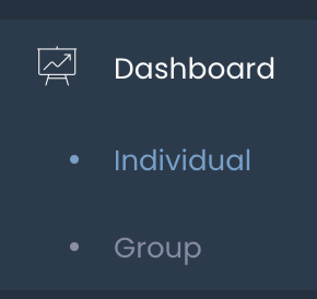
To access the quantitative model/report, click on 'Dashboard' from the navigation sidebar on the left.
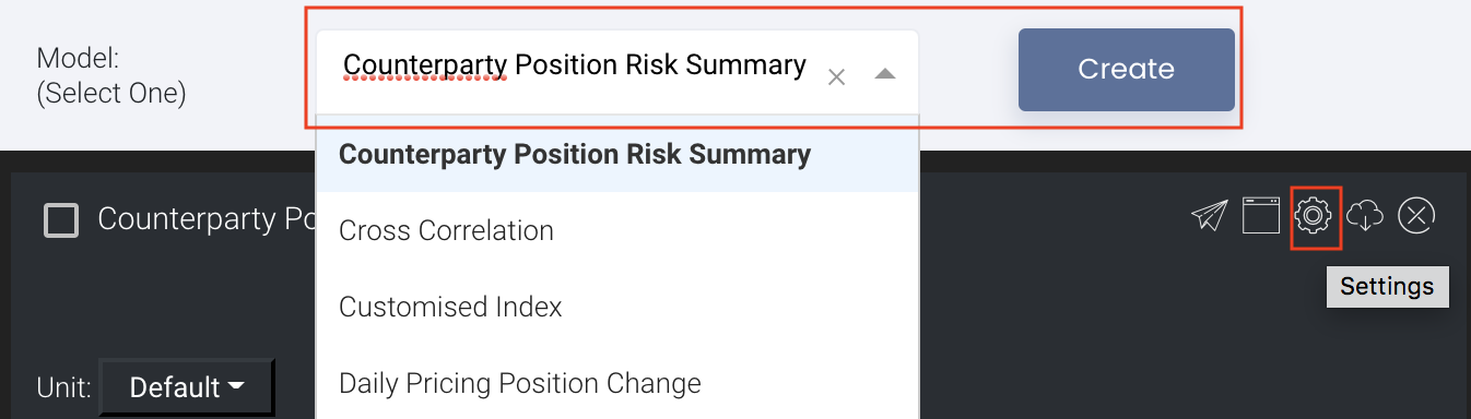
Select the model/report from the drop-down list and click 'Create'. Click on the 'Settings' button (gear icon) at the top right corner of the model to set up your model/report.
Sharing Model/Report/Dashboard
To share the model with your group members, click on the "Share" button next to the Title of the model followed by the email address of the group members you want to share it with. Once submitted, the model will appear in the Dashboard>Group Dashboard of the selected group members.

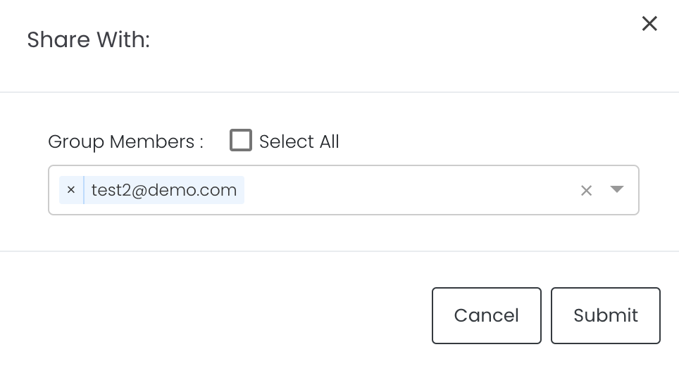
This is different from sharing individual or entire Dashboard models/reports, which allows any user who may or may not be users of MAF Cloud to access the individual model/entire dashboard via the shared web link (link will expire in 8 hours). In Group Dashboard, only group members can access the shared models/reports.
Group Rows
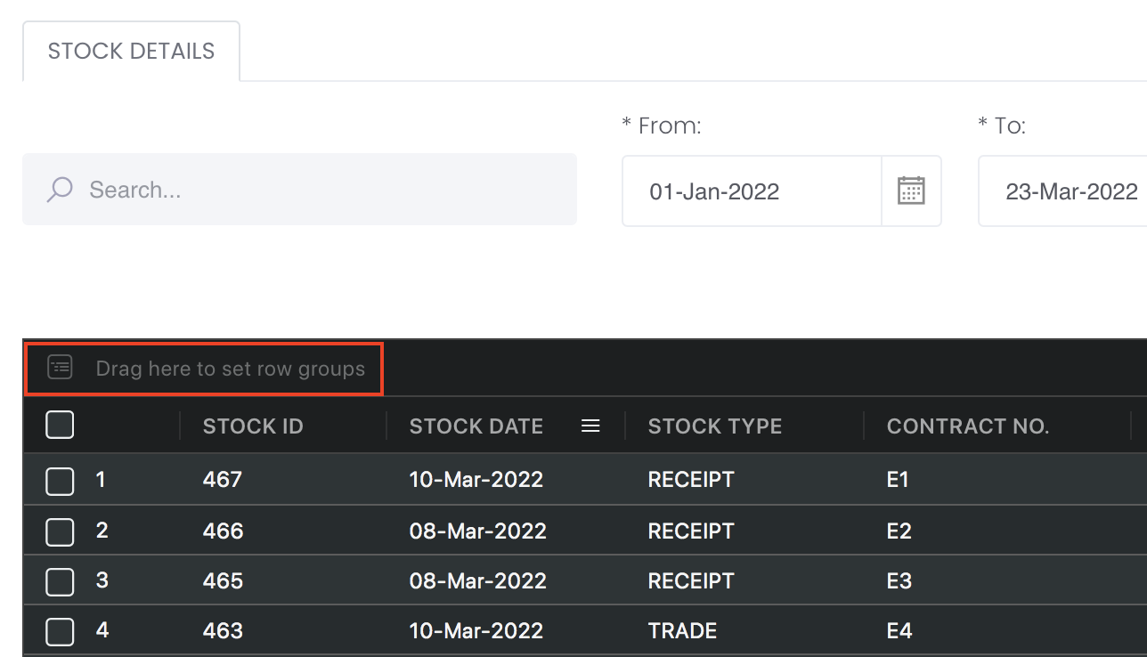
You may also group the rows (liken to the pivot table function in Microsoft Excel) to view the grouped data by dragging any column headers into the “row groups” section as highlighted:
Guide
| Name | Image/Description |
|---|---|
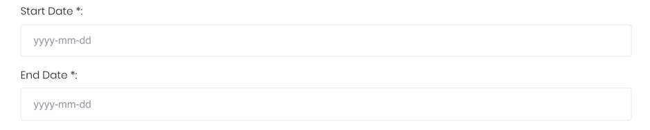
| Duration |
Select the start and end date of the period for analysis. |
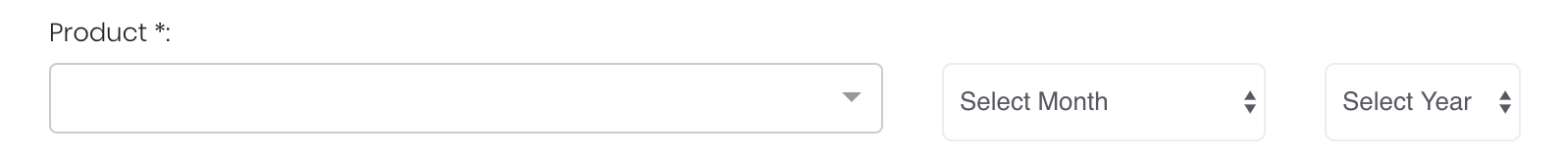
| Product |
Input product of interest under 'Product'. Select the contract month and year for the product of interest. |
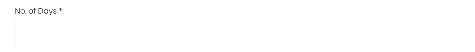
| Days |
The user will be able to choose the number of days for which forward curves will be shown on the graph. The most recent curves will be displayed (e.g. if no. of days = 3, the forward curves of the latest 3 trading days will be shown). This allows the user to view recent movements in the forward curves. |
| Comments |
The inserted comments will be displayed at the bottom of the application. This can be useful for documentation purposes or for settings description. |

Input
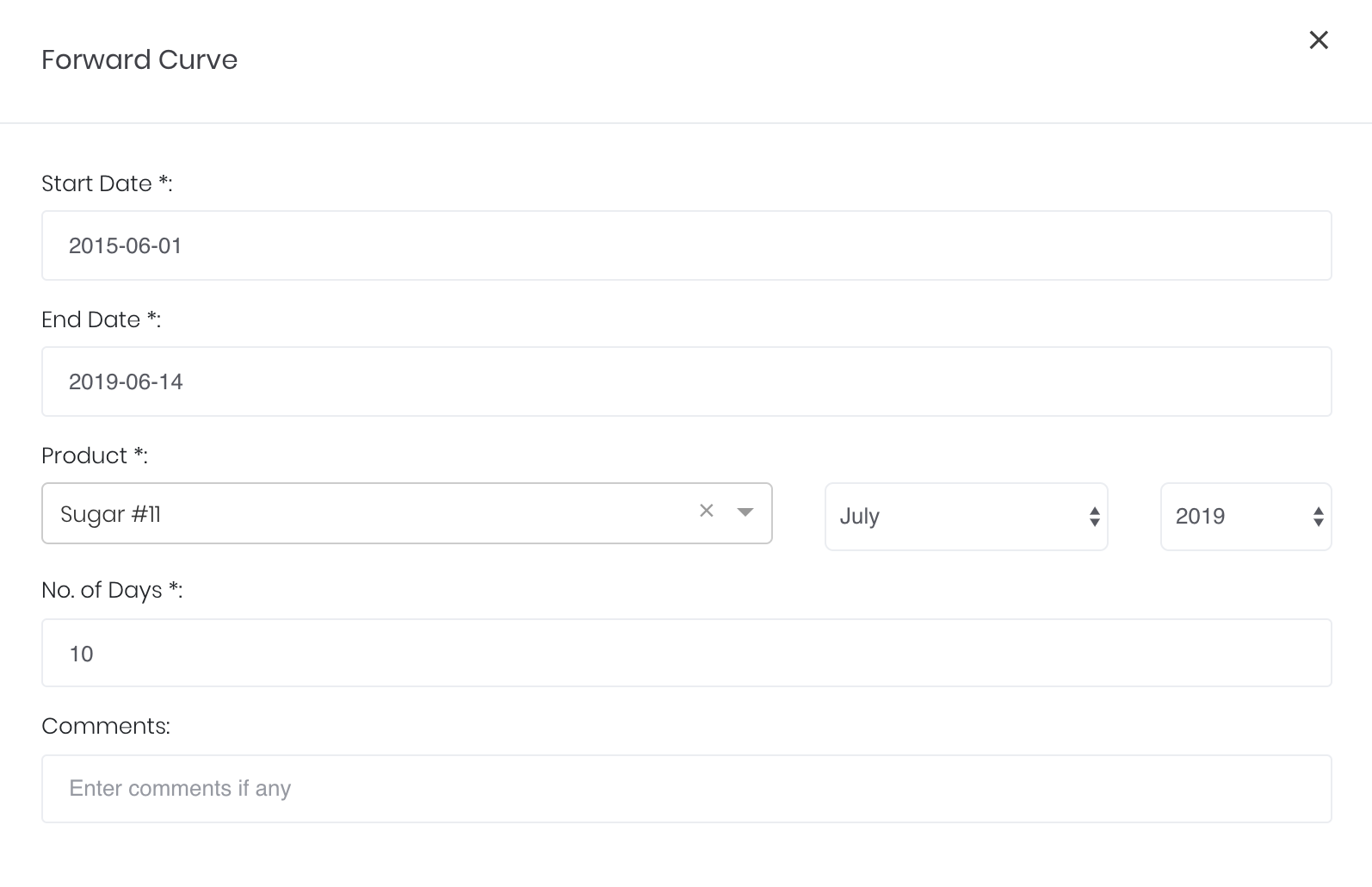
| Name | Description | Type | Example |
|---|---|---|---|
| Start Date | Start of the product time series. | Date (YYYY-MM-DD) | 2018-07-01 |
| End Date | End of the product time series. | Date (YYYY-MM-DD) | 2019-07-01 |
| Product | Product of interest. | Product Name (Selection) | Sugar #17 |
| Product's contract month. | Month | July | |
| Product's contract year | Year | 2019 | |
| Days | Number of forward curves to be generated, 1 per day from the end date. | Numerical Value | 10 |
| Comments | Useful for documentation purposes or for settings description. | Text | - |
Output
| Name | Description | Type |
|---|---|---|
| Time-Series | Displays the historical time-series of product. | Plot |
| Forward Curve(s) | Displays the forward curves for the latest trading days. | Plot |
Example
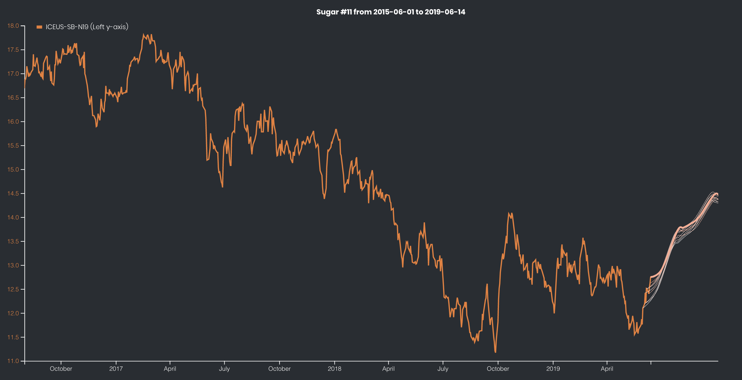
The futures market for Sugar #11 is in contango: the settlement price for future delivery is higher than the spot price.
Functionality
Displayed below are some noteworthy user interactions you can find on this application. The forward curve projection is displayed at the far right of the chosen product's time-series.
| Name | Description | Interaction |
|---|---|---|
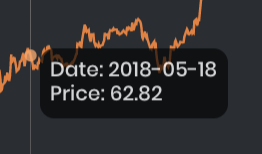
| Multi Tooltip Lines (Vertical and Horizontal) | Mouse-over the time-series section of the graph and a circle will appear with a tooltip displaying the X-axis value ('Date') and the Y-axis value (corresponding index series value) of that point (not available for the forward curves section).
| Plot Element |
Click to access: