Portfolio Performance Chart
- IT Support
Return to Overview
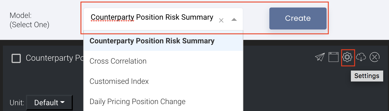
To access the quantitative model/report, click on 'Dashboard' from the navigation sidebar on the left. Select the model/report from the drop-down list and click 'Create'. Click on the 'Settings' button (gear icon) at the top right corner of the model to set up your model/report.
About
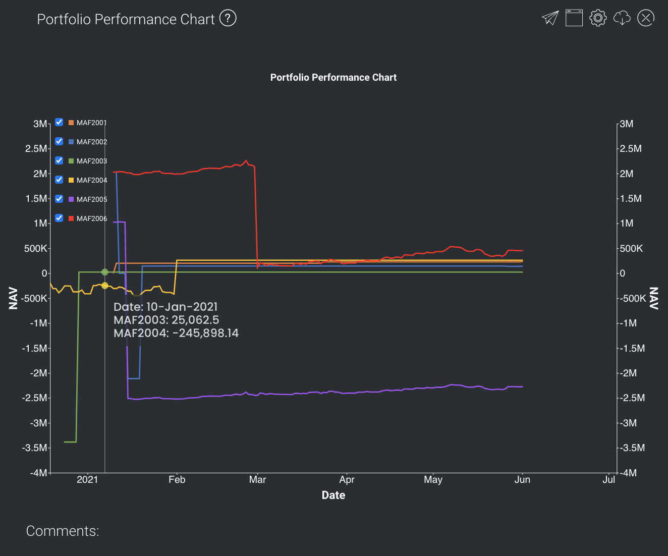
The Portfolio Performance Chart model allows the user to plot various series alongside each other on the same graph, with options to display the group (portfolio, category, trader, strategy or company) of single or multiple portfolios to view their performance (accumulative Group P/L: only shows last day P/L). It is used to visualise the performance of each portfolio in terms of Group P/L against each other.
Navigation
To access the quantitative model/report, click on 'Dashboard' from the navigation sidebar on the left.
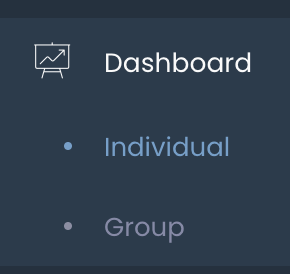
Select the model/report from the drop-down list and click 'Create'. Click on the 'Settings' button (gear icon) at the top right corner of the model to set up your model/report.
Sharing Model/Report/Dashboard
To share the model with your group members, click on the "Share" button next to the Title of the model followed by the email address of the group members you want to share it with. Once submitted, the model will appear in the Dashboard>Group Dashboard of the selected group members.
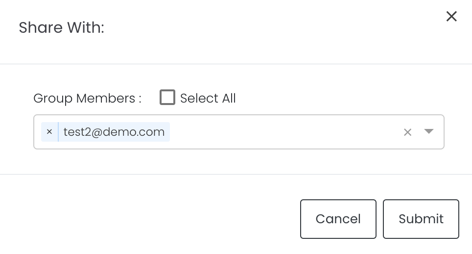
This is different from sharing individual or entire Dashboard models/reports, which allows any user who may or may not be users of MAF Cloud to access the individual model/entire dashboard via the shared web link (link will expire in 8 hours). In Group Dashboard, only group members can access the shared models/reports.
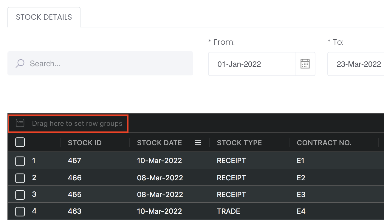
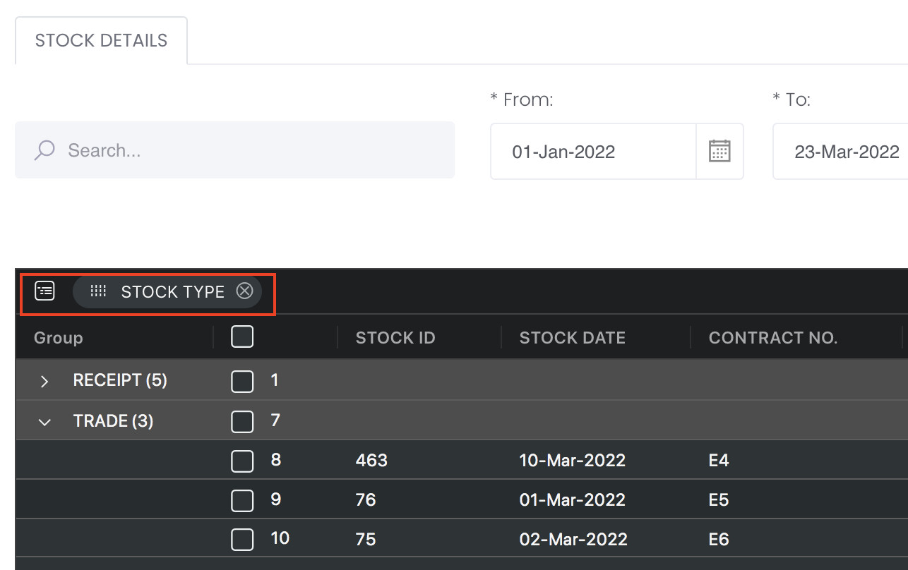
Group Rows
You may also group the rows (liken to the pivot table function in Microsoft Excel) to view the grouped data by dragging any column headers into the “row groups” section as highlighted:
Guide
| Name | Image/Description |
|---|---|
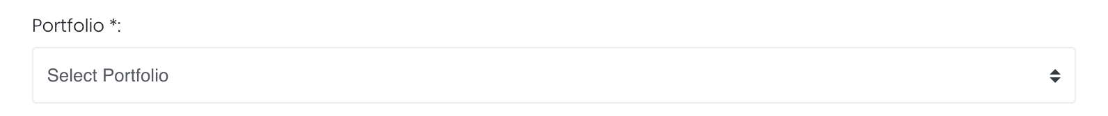
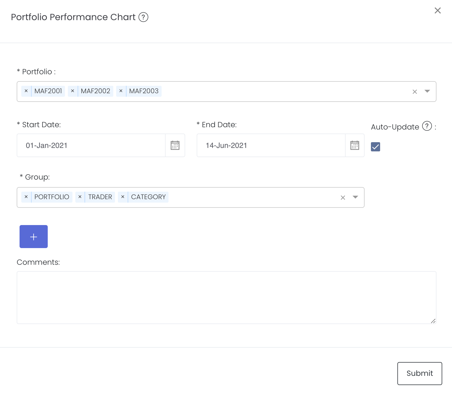
| Portfolio |
Select a/multiple portfolio(s) of interest. |
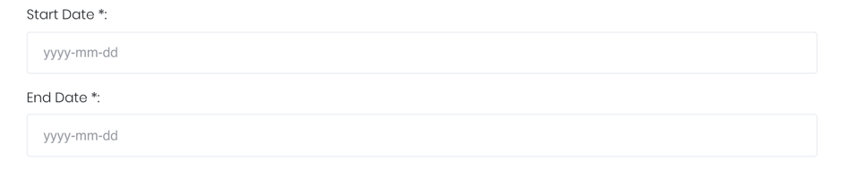
| Duration |
Select the start and end date of the time series. |
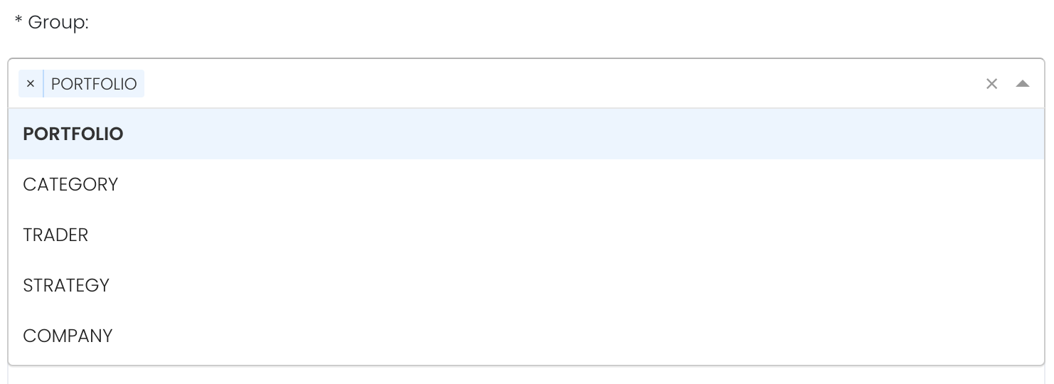
| Group |
Select the group category to show the group P/L of the group category accordingly. PORTFOLIO will be displayed as the default. |
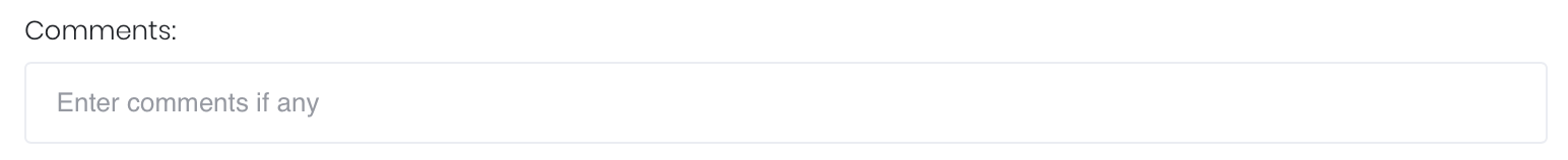
| Comments |
The inserted comments will be displayed at the bottom of the application. This can be useful for documentation purposes or for settings description. |
Input
| Name | Description | Type | Example |
|---|---|---|---|
| Portfolio | Portfolio selected | Portfolio | ABC |
| Start Date | Start of products' cross-correlation. | Date (YYYY-MM-DD) | 2015-06-01 |
| End Date | End of products' cross-correlation. | Date (YYYY-MM-DD) | 2019-06-14 |
| Group | Group category; namely, Portfolio, Trader and Category. Portfolio is default | Category | Lead |
| Comments | Useful for documentation purposes or for settings description. | Text | - |
Output
Name | Description | Type |
|---|---|---|
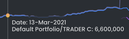
| Graph | Each selected group category of each portfolio's group P/L will be shown as a time-series of a different colour. The legend indicating the product and its colour will be displayed at the top of each Y-axis. | Plot |
Example
Functionality
Displayed below are some noteworthy user interactions you can find on this application.
Name | Description | Interaction |
|---|---|---|
| Multi Tooltip Lines (Vertical and Horizontal) |
Mouse-over the graph and circle(s) will appear on the various time-series point(s) with a tooltip that displays the X-axis value ('Date') along with all the values (Group P/L) on the Y-axis. | Plot Element |
Click to access: