Efficient Frontier Model
- IT Support
- e0031959 (Unlicensed)
- Qiwei (Unlicensed)
Return to Overview
About
The Efficient Frontier shows the set of optimal portfolios that offer the highest expected return for a defined level of risk, or the lowest risk for a given level of expected return (the constituent assets in the portfolio are selected by the user in the Create Portfolio section).
The model will simulate a large number of portfolios by randomly assigning different weights to each asset in the user's portfolio, calculating the volatility, return and Sharpe ratio for each simulation. These portfolios will be plotted as points on a scatter-plot, with the annualised expected return on the vertical axis and volatility on the horizontal axis. The Sharpe ratio of the points are colour-coded according to a colour legend. The efficient frontier (which envelopes the points) is also calculated and shown.
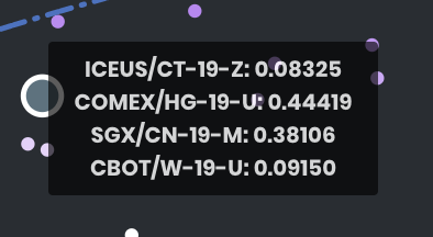
The model further calculates 2 particular portfolios: the maximum Sharpe ratio portfolio and the minimum risk portfolio – they are shown as highlighted points in the graph; the user can mouse-over to view the suggested weights of each asset in the respective portfolios. The user's own portfolio is shown for easy comparison of its risk and return profile against the efficient frontier.
Guide
| Name | Image/Description |
|---|---|
| Duration |
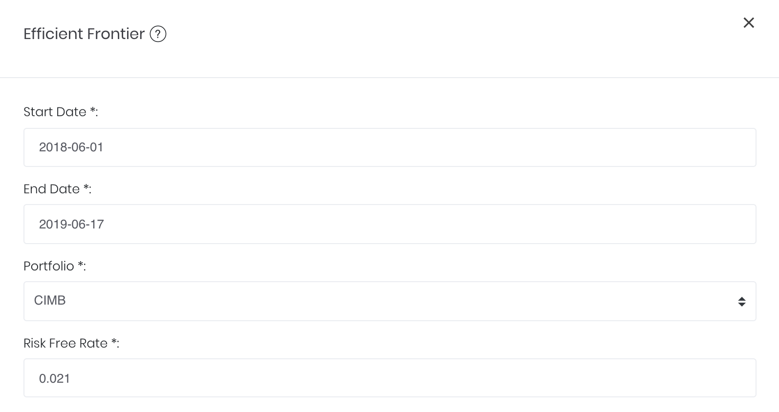
Select the start and end dates for which past returns' statistics (of assets in the portfolio) are used when generating the Efficient Frontier graph. |
| Portfolio |
Select the portfolio to be analysed. |
| Risk-Free Rate |
The risk-free interest rate is inserted by the user and is used in calculating the portfolio's Sharpe ratio. (The current T-bill rate is the suggested value for the risk-free rate.) |
| Comments |
The inserted comments will be displayed at the bottom of the application. This can be useful for documentation purposes or for settings description. |


Input
| Name | Description | Type | Example |
|---|---|---|---|
| Start Date | Start date for Efficient Frontier analysis. | Date | 2018-06-01 |
| End Date | End date for Efficient Frontier analysis. | Date | 2019-06-17 |
| Portfolio | Portfolio to be analysed. | Portfolio | - |
| Risk-Free Rate | The risk-free interest rate (inserted by user) is used for calculating Sharpe ratio. | Numerical Value | 0.021 |
| Comments | Useful for documentation purposes or for settings description. | Text | - |
Output
| Name | Description | Type |
|---|---|---|
| Efficient Frontier Curve | Displays the efficient frontier curve of the analysed portfolio, with the annualised return on the Y-axis and annualised volatility on the X-axis. | Plot |
| Sharpe Ratio | Measures the ratio of excess return (above risk-free rate) to volatility for various portfolio allocations (points) on the graph. Represented as a gradient-coloured bar on the right of the graph, with a deeper shade of purple indicating a higher Sharpe ratio. | Plot |
| Significant Points | 3 particular portfolios are shown as significant points: minimum volatility of the portfolio, maximum Sharpe ratio of the portfolio and the user's current allocation. These dots are much larger, and upon mouse-over displays a tooltip showing the portfolio's asset allocation. | Plot |
Example
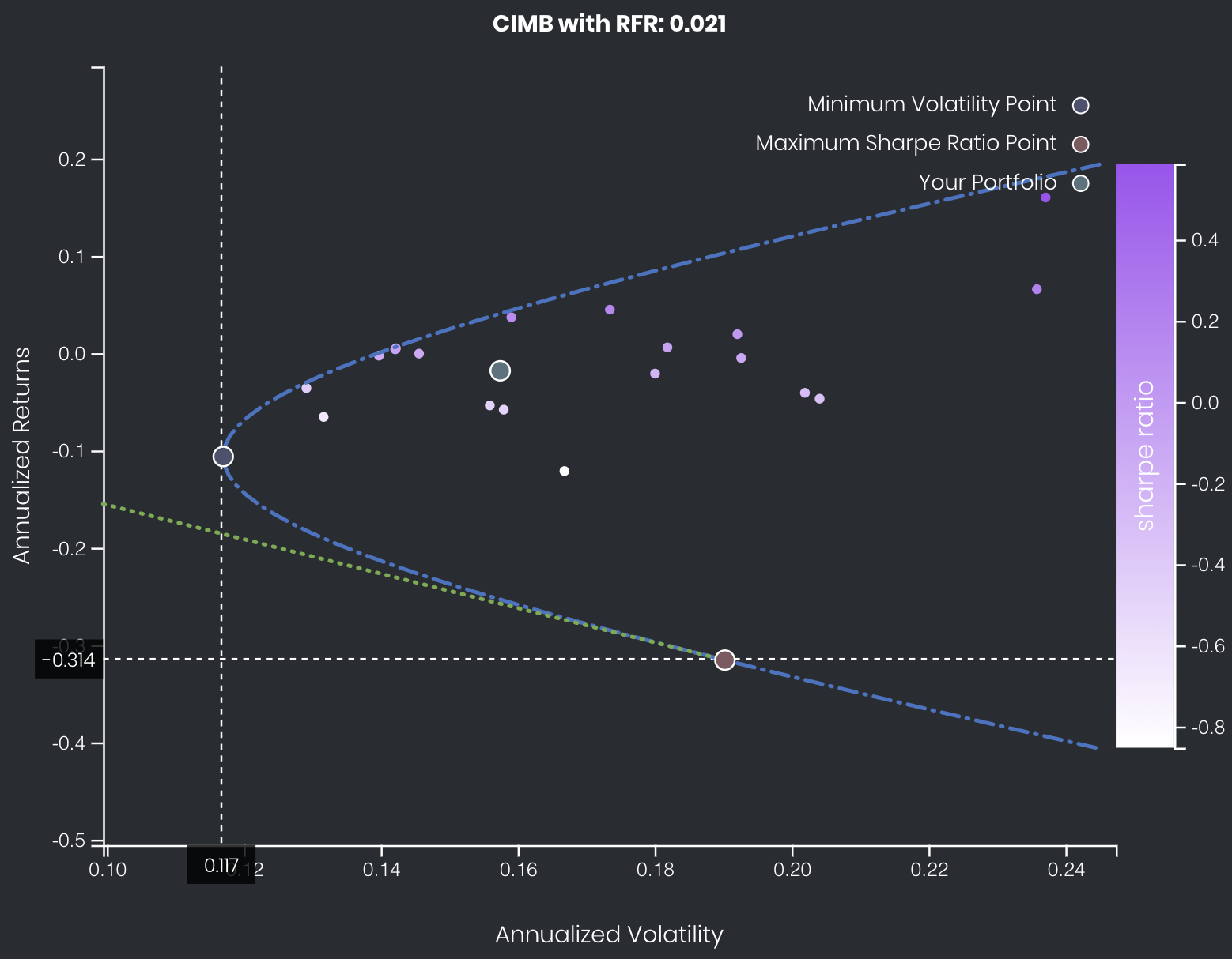
The user's current portfolio in this example is not ideal, as it is not on the Efficient Frontier. By adjusting the allocation of assets in his/her portfolio, the user can achieve a higher return for the same risk, or the same return with a lower risk. An efficient allocation (using the existing assets in his/her portfolio) would be the Maximum Sharpe Ratio portfolio (point shown in red) – when combined in varying proportions with a riskless asset such as cash, he/she can produce any desired return with the minimum risk with this portfolio allocation.
Note: The Maximum Sharpe Ratio portfolio shown here provides a negative return; the efficient return is achieved by shorting this portfolio (ie. taking the opposite position on assets in the portfolio).
Functionality
Displayed below are some noteworthy user interactions you can find on this application.
| Name | Description | Interaction |
|---|---|---|
| Multi Tooltip Lines (Vertical and Horizontal) | Mouse-over the graph, and the X-axis value ('Annualised Volatility') and Y-axis value ('Annualised Return') will be shown on the respective axes. | Plot Element |
| Significant Points Tooltip | Displays the exact asset allocation of significant points upon mouse-over.
| Plot Element |
Click to access: