...
| Name | Image/Description |
|---|---|
| Duration | Select the start and end dates for which past returns' statistics (of assets in the portfolio) are used when generating the Efficient Frontier graph. |
| Portfolio |
Select the portfolio to be analysed. |
| Risk-Free Rate |
The risk-free interest rate is inserted by the user and is used in calculating the portfolio's Sharpe ratio. (The current T-bill rate is the suggested value for the risk-free rate.) |
| Comments |
The inserted comments will be displayed at the bottom of the application. This can be useful for documentation purposes or for settings description. |


...
| Name | Description | Type |
|---|---|---|
| Efficient Frontier Curve | Displays the efficient frontier curve of the analysed portfolio, with the annualised return on the Y-axis and annualised volatility on the X-axis. | Plot |
| Sharpe Ratio | Measures the ratio of excess return (above risk-free rate) to volatility for various portfolio allocations (points) on the graph. Represented as a gradient-coloured bar on the right of the graph, with a deeper shade of purple indicating a higher Sharpe ratio. | Plot |
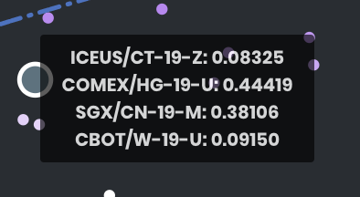
| Significant Points | 3 particular portfolios are shown as significant points: minimum volatility of the portfolio, maximum Sharpe ratio of the portfolio and the user's current allocation. These dots are much larger, and upon mouse-over displays a tooltip showing the portfolio's asset allocation. | Plot |
Example


The user's current portfolio in this example is not ideal, as it is not on the Efficient Frontier. By adjusting the allocation of assets in his/her portfolio, the user can achieve a higher return for the same risk, or the same return with a lower risk. An efficient allocation (using the existing assets in his/her portfolio) would be the Maximum Sharpe Ratio portfolio (point shown in red) – when combined in varying proportions with a riskless asset such as cash, he/she can produce any desired return with the minimum risk with this portfolio allocation.
...
| Name | Description | Interaction |
|---|---|---|
| Multi Tooltip Lines (Vertical and Horizontal) | Mouse-over the graph, and the X-axis value (annualised volatility) and Y-axis value (annualised return) will be shown on the respective axes. | Plot Element |
| Significant Points Tooltip | Displays the exact asset allocation of significant points upon mouse-over.
| Plot Element |

...
Click to access:
| Page Tree |
|---|
...