This is a question investors are always asking when buying stocks. When would be a better time to buy stocks? Is it now, or later?
In the previous article, we showed a high correlation between stock and bond prices. In this article, we will use US Treasury Bonds (T-bonds) as a benchmark in evaluating whether stocks are currently expensive or cheap.
Using the Spread Analysis Model from MAF Cloud, we are able to plot the Dow Jones Stock E-Mini Futures Price against the US T-Bond futures. This would allow us to compare current stock prices to their theoretical (bond-benchmarked) values, and identify if stocks are considered cheap or expensive at that point of time.

From the graph above, we can see the periods when stocks are expensive (the areas marked green) relative to bonds, and when they are cheap (the areas marked red).
Basing off the model, we are able to derive a mean value of 9084.78 and standard deviation of 4608.34, as well as the lowest and highest values (-265.78,19846.08). We are also able to see the distribution of the spread between the two markets as a U-graph (see below to learn how the formula is derived).
In the past 3 years, stocks experienced strong growth relative to bonds, partly fueled by quantitative easing by major central banks which are driving yields down and stock prices up. As of current, stocks are moderately overvalued compared to bonds, with a z-score of 1.071, and are hence expensive to buy.
A smart investor would always pounce at the opportunity to buy stocks when they are cheap. By using our Spread Analysis Model, you would be able to tell when stocks are cheap - opening up an opportunity for you to purchase stocks that are undervalued. Would you try to spot for this opportunity to purchase stocks when they are cheap?
The Spread Analysis Model is also useful for comparing the relative value of commodities and currencies, showing the variance and relative displacement of 2 products. Do give it a try!
How to generate this graph on MAF Cloud:
For the Spread Analysis Model, set ‘Start Date’ as “2006-09-13” and ‘End Date’ as the current date. Select “Dow Indu 30 E-Mini” as ‘Product a' and “T-Bond” as ‘Product b’. Set the 2 products for analysis as continuous (tick ‘CONT’) and input ‘Serial No.’ as “1” for both. Select the unit for both products as “Default”. Insert the 'Formula’ as “a-(b-100)*(26000/90)+4000”.
How the formula was generated:
Dow Jones Stock E-Mini Futures Price = CBOTM-YM
US T-Bond = CBOT-ZB
The formula was derived by CBOTM-YM - [CBOT-ZB - (minimum of CBOT-ZB y-axis)] * [(maximum of CBOTM-YM y-axis - minimum of CBOTM-YM y-axis)/(maximum of CBOT-ZB y-axis - minimum of CBOT-ZB y-axis)] + minimum of CBOTM-YM y-axis = CBOTM-YM - (CBOT-ZB - 100) x (26000/90) +4000.
Click here to try MAF Cloud (Beta) for free today!

Surely many investors would think this way, but is this for a fact, true? Do stock prices really go down when bond prices go up?
When looking at the short-term relationship between these two investment securities, stock prices and bond prices do truly have an inverse relationship with each other. However, when looking at a long-term relationship, it might prove to be a different story.
By using the Cross-Correlation Model available in MAF Cloud, we were able to put the Dow Jones Stock E-Mini Futures Price against that of CBOT US 30-Year T-Bond for a span of 20 years.

As evident from the graph, both securities actually prove to have a historically high positive correlation (r=72.84%) with each other.
Indeed, the two often move in opposite directions in the short run, especially seen in the crisis years 2008-2010. During times of uncertainty, stock prices will fall significantly, as investors seek safety in T-bonds, hence driving its price up. In general, stocks are much more sensitive to market cycles than bonds. Bond yield is often considered an indicator of investors' confidence: during bull markets, prices of T-bonds will fall instead, as investors take on more risk and look for higher-return investments in stocks, causing it to outperform bonds.
However, as the two assets are affected by common market trends, they tend to move in the same direction in the long run. A lower bond yield would attract investors to invest in stocks that provide higher percentage returns. This is particularly evident when an economy is just recovering from a recession – both stock and bond prices move up in tandem, as interest rates are low and economic growth is expected to pick up. As the Fed is easing monetary policy recently to boost the economy, such a positive correlation is likely to be seen in recent times as well.
As investors, the prediction of future trends of bond and stock prices is essential. If bond yield continues to decline, the current upward trend of stocks could persist. However, could there be a limit to how low bond yields go? By using the Time Series Model available in MAF Cloud and basing it on FRED’s 30-Year Treasury Rates, we would be able to see the trend in bond yields in the past 10 years.

Looking at the graph, bond yields indeed seem to be in a downward trend. In the span of less than a year, yields have dropped from 3.46% to 2.11% (as of 12/09/2019). Does this mean that the FRED’s Treasury rates could potentially drop further? If it does, how high can stock prices go?
Several recent trends seem to be pushing yields even lower, such as ECB’s announcement on Thursday to resume quantitative easing and sustained asset purchases by the Fed, which can potentially push yields into negative territory. If we expect a positive correlation between stock and bond prices, we can expect a rallying of the stock market together with the bond prices in the future.
However, an important question investors may ask is: Is such a policy of lowering interest rates sustainable? Can the US T-bond yield turn negative and stay that way? It is not impossible, considering this is already the case for German bonds and shorter-term T-bills. Furthermore, the Fed’s plan to introduce 50- and 100-year bonds will expand the bank’s policy tools, providing further room to push down the yield curve in order to support an expansionary monetary policy.
Given the current situation:
What should investor’s expectation of future yields (and hence stock prices) be? Would monetary expansion continue or eventually reverse?
Is the current upward trend in stock prices driven by lowering yields or improving market sentiment? Are we entering a bull market, or would there be a correction if policy intervention ends?
Are current stock prices expensive or cheap? In next week’s article, we would be analysing this question using the Spread Analysis Model. So stay tuned!
How to generate the graphs on MAF Cloud:
For the Cross-Correlation Model, set start date as “1989-09-12” and end date as the current date. Select “Dow Indu 30 E-Mini” and “T-Bond” as the 2 products for analysis. Set continuous (tick ‘CONT’) and ‘Serial No.’ as “1” for both products. Select the unit for both products as “Default”. ‘Plot Reverse’ can remain as “False” and 'Shift Flag’ can remain as “True”.
For the Time Series Model, set ‘Start Date’ as “2009-09-12” and ‘End Date’ as the current date. Select “30-Year Treasury Constant Maturity Rate Daily (Not Seasonally Adjusted)” as the product. Select the unit for the product as “Default”.
Click here to try MAF Cloud (Beta) for free today!

In addition to providing data from multiple exchange sources, brokers and third-party data vendors, MAF Cloud also allows users to upload and manage their own market data. We will be using a case study to demonstrate how you can maximise your MAF Cloud experience by using and managing your own market data!
TABLE OF CONTENTS
Adding your Own Market Data
Creating New Market Data
Click ‘Create Market Data’ under ‘Market Data’ in the navigation list on the left.
Fill in your own ‘Data Name’ (e.g. 螺纹钢:HRB400 20mm:唐山).
Fill in 'Exchange', which refers to the Exchange the product is traded in (e.g. 唐山).
Fill in ‘Product Code’, which helps you to identify the data easily by its product code (e.g. HRB400_20_TS).
Fill in 'Contract Code', which helps you to identify the data easily by its contract code (e.g. HRB400_20_TS).
Fill in 'Data Source', which refers to the source of data (e.g. Self).
Select the data's 'Product Type', in which four options are available (e.g. "Fundamental"). Different product types require inputting of different types of data. Click Market Data Structure to find out more.
You are able to fill in ‘Frequency’ (e.g. Daily).
‘Frequency’, ‘Unit’ and ‘Description’ are optional fields.
Example:

Figure 1: Dataset & Basic Information
After filling in your market data’s information, you can start to add the market data’s historical information.
Adding your Own Historical Data
You will be able to add your own historical data using any of the following methods:
Copying and pasting the data into the table, or
Importing the data using a .CSV file, or
Manually keying the data into each cell.
Copying and Pasting your Data into the Table
Select the column of your own dataset that you wish to copy into the table.
Paste into the relevant and required column in MAF Cloud’s table. For different product types, the table requires different information. Click Market Data Structure to find out more.
Ensure that the required column has a value in every row (e.g. Date column = YYYY-MM-DD; Settlement column = if null, 0).
After inputting the relevant and required data into the table, click ‘Save’.
You will be able to see the newly created market data by clicking ‘View Market Data’ under ‘Market Data’ in the navigation list on the left. Search for the dataset that you wish to view (e.g. 螺纹钢:HRB400 20mm:唐山) and click on the ‘View’ button (represented by an “eye” icon).

Example:
| 1 | 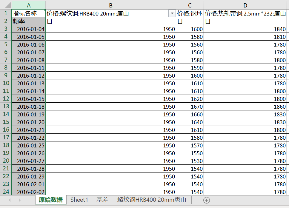 | Open your file in Microsoft Excel. Select and copy the column you wish to transfer into MAF Cloud. |
| 2 | 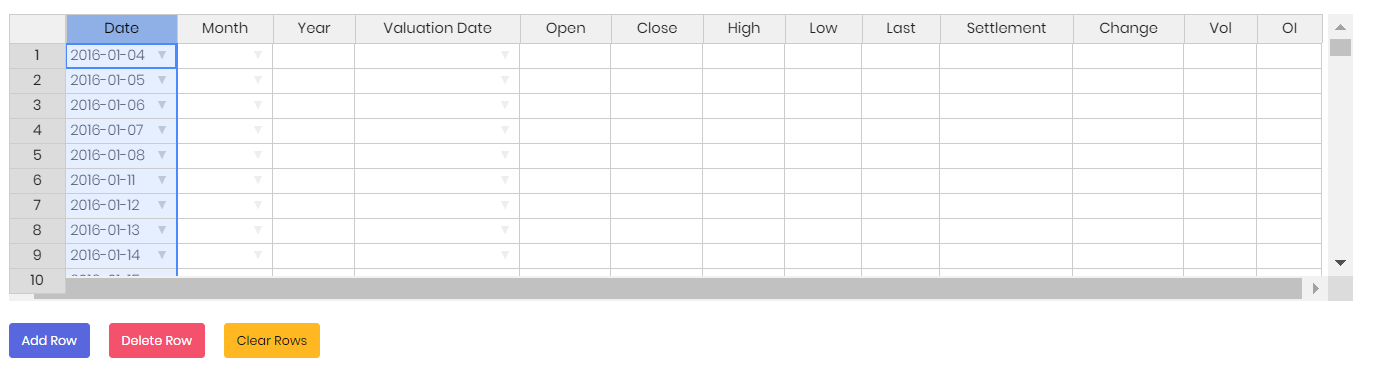 | Return to MAF Cloud and select column header (in this case, ‘Date’), and paste the copied data. All the information would immediately be transferred onto the table. |
| 3 | 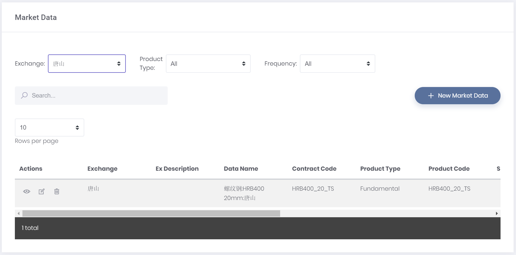 | After clicking ‘Save’, you would be able to view your newly created market data by clicking ‘View Market Data' under 'Market Data’ in the navigation list on the left. Simply search for the dataset that you wish to view (e.g. 螺纹钢:HRB400 20mm:唐山) and click on the “View” button (represented by an ‘eye’ icon). |
Importing your Data into the Table
Ensure that your file is in .CSV format, following MAF Cloud’s table format.
In order to do so, open your file in Microsoft Excel.
Arrange your information according to MAF Cloud’s table format. For different product types, the table requires different information. Click Market Data Structure to find out more. Ensure that the required column has value in every row (e.g. 0).
Columns in Microsoft Excel that corresponds with MAF Cloud’s table format are as follows:

After rearranging the required information, export it as a .CSV file.
Return to MAF Cloud and import the file by clicking '+ Import from CSV'.
Click 'Save'.
You will be able to see the newly created market data by clicking ‘View Market Data', followed by ‘Market Data’ in the navigation list on the left. Search for the dataset that you wish to view (e.g. 螺纹钢:HRB400 20mm:唐山) and click on the 'View’ button (represented by an “eye” icon).
Example:
| 1 | 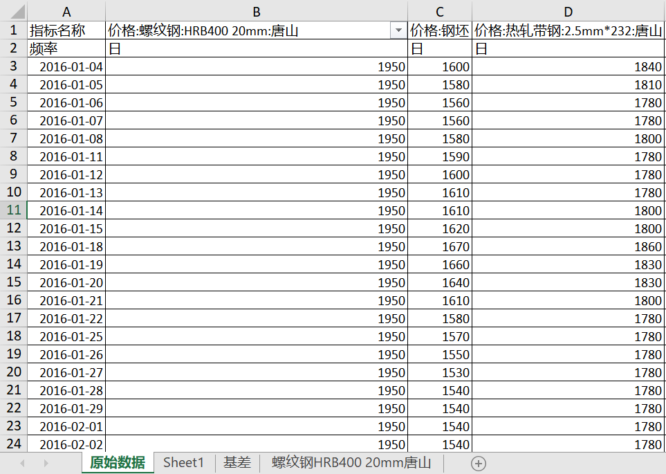 | This is the original data (including other datasets) after exporting into Microsoft Excel. You have to rearrange it to fit the format in MAF Cloud’s table. |
| 2 | 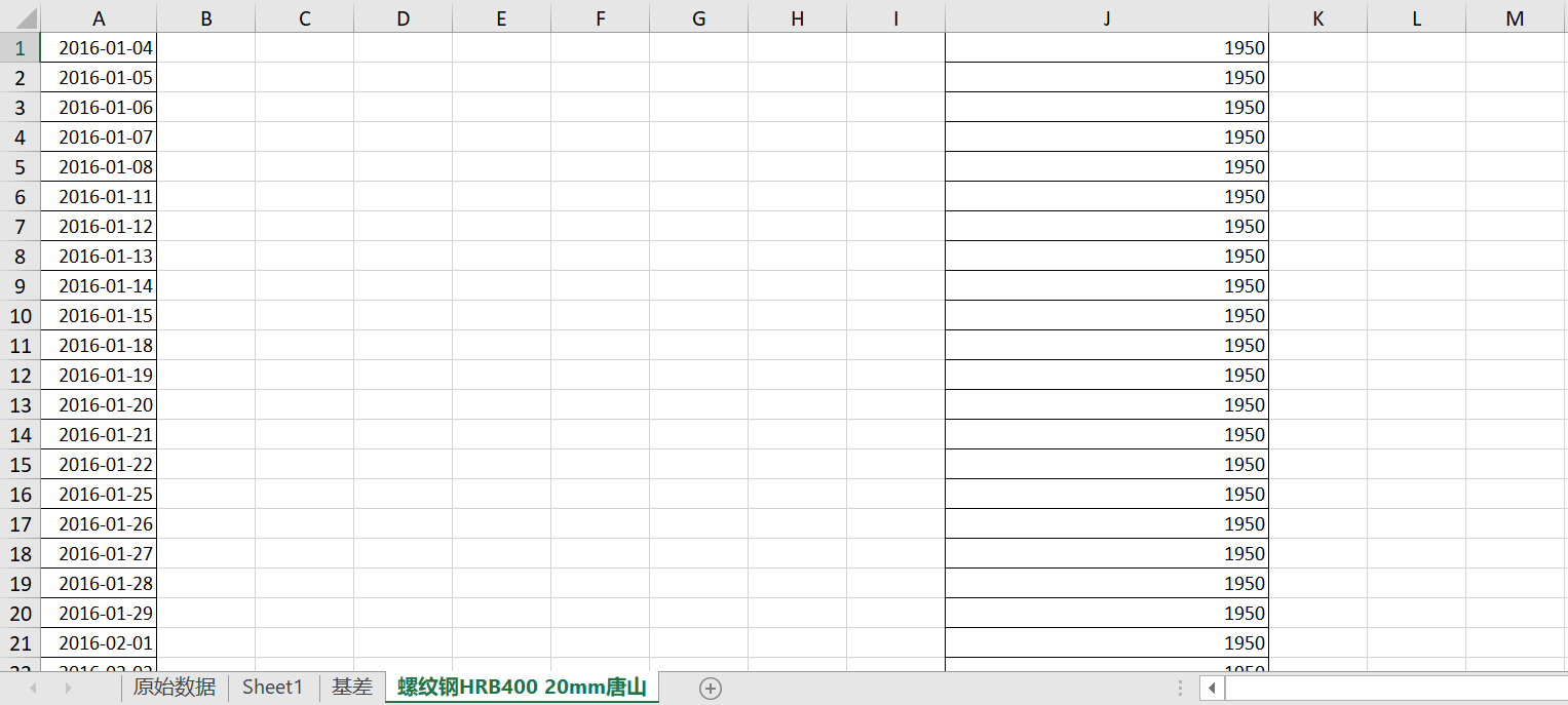 | This is how it should be rearranged. Since this is a ‘Fundamental’ product type, only the “Date” (A) and “Settlement” (J) column are needed. The rest can be left empty. |
| 3 | | Click ‘Save’ to save your Market Data, which will be available under ‘Market Data’, ‘View Market Data’. |
Keying in your Data Manually into the Table
Key in all the relevant and required column manually into MAF Cloud’s table. For different product types, the table requires different information. ClickMarket Data Structure to find out more. Ensure that the required column has a value in every row (e.g. 0).
Click 'Save'.
You will be able to see the newly created market data by clicking 'View Market Data', followed by ‘Market Data’ in the navigation list on the left. Search for the dataset that you wish to view (e.g. 螺纹钢:HRB400 20mm:唐山) and click on the “View” button (represented by an ‘eye’ icon).
Editing Market Data
After saving your market data and information, you will be able to edit it:
Click 'View Market Data' under ‘Market Data’ in the navigation list on the left.
Search for the dataset that you wish to edit (e.g. 螺纹钢:HRB400 20mm:唐山).
Click on the edit button under the 'Actions' column (represented by a “pen and paper” icon).

After editing the information, click ‘Save’.
Example:
| 1 |  | After searching for your ‘Market Data’, you will be able to edit by clicking the edit button under the ‘Actions” column (represented by a “pen and paper” icon). |
| 2 | 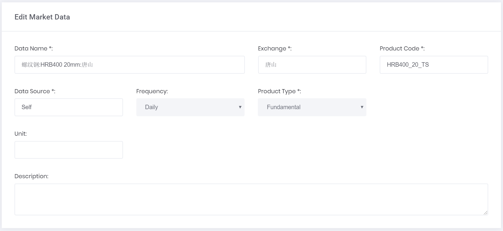 | You will be able to edit the information in the selected ‘Market Data’. *Fields are compulsory. Note: Once the ‘Frequency’ and ‘Product Type’ have been set, they cannot be changed. |
| 3 | 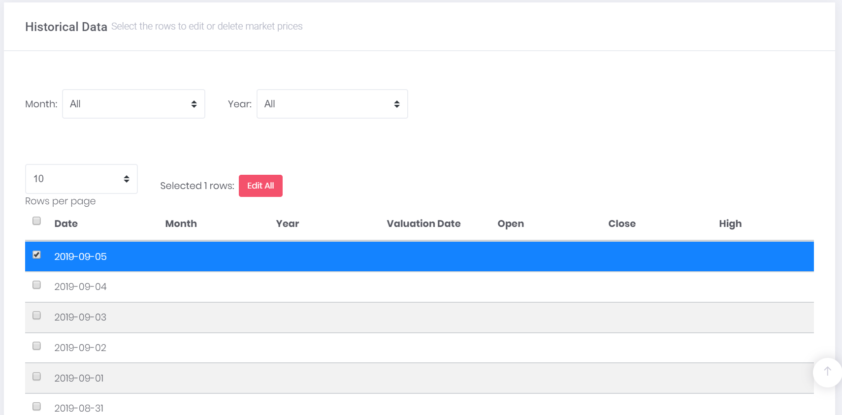 | As you scroll down, you will be able to edit the ‘Historical Data' as well. Click on the checkbox in the row you wish to edit and then press 'Edit All’. |
| 4 | 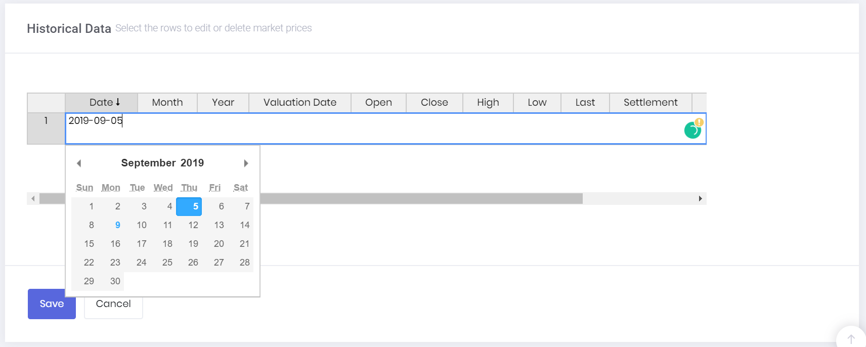 | Then, double click the cell you wish to edit and key in the updated detail. After editing, click ‘Save’. Note: Please ensure that the data in each column is formatted correctly (e.g. date format must be YYYY-MM-DD; number format must be used in the “Settlement Price” column; and 0 represents null value) |
Adding Additional Market Price Information
If you wish to add additional market prices into an already-created market data, you are able to do so:
Click ‘View Market Data' under 'Market Data’ in the navigation list on the left.
Search for the dataset that you wish to edit (e.g. 螺纹钢:HRB400 20mm:唐山).
Click on the edit button under the ‘Actions’ column (represented by a “pen and paper” icon).

Under Historical Data, click 'Add New Market Prices'.
Add the relevant information into the table to add new market data. Delete the rows if they are not used (highlight the rows by clicking on the header of the row e.g. 1, 2, 3 etc)
Click 'Save'.
Deleting Market Data
If you do not require the Market Data anymore, you will be able to delete it:
Click ‘View Market Data’ under 'Market Data' in the navigation list on the left.
Search for the dataset that you wish to edit (e.g. 螺纹钢:HRB400 20mm:唐山).
Click on the ‘delete' button under the 'Actions’ column (represented by a “bin” icon).

If you want your Market Data to be deleted, click on ‘Yes, delete!’ and it would be deleted. Do note that this is an irreversible action.
If you do not want your Market Data to be deleted, click on ‘No, cancel!’ and it would not be deleted.
Using MAF Cloud’s Quantitative Model
You are able to use MAF Cloud’s quantitative model(s) with the ‘Market Data’ you have just created.
An example would be using the Spread Analysis Model which can be found under ‘Dashboard’ from the navigation list on the left.
Comparing 螺纹钢:HRB400 20mm:唐山 Market Data and Steel Rebar Market Data in the Spread Analysis Model:

Figure 2: Spread Analysis Model
Exporting Data
You would be able to export data from “Historical Data” and from the quantitative models available in MAF Cloud.
Exporting Data from Historical Data
Click ‘View Market Data' under 'Market Data’ in the navigation list on the left.
Search for the data you wish to export.
Click the ‘View’ button (represented by the “eye” icon).
Click on 'Export Data' from the right corner of the page and you would be able to export this as a .CSV file.
Exporting Data from Quantitative Models
Select the model you wish to export from your ‘Dashboard’.
Click on the export icon (represented by a “cloud and arrow”).

You will be able to export the data as a .CSV file or as an image.
You are not only able to use the data available in MAF Cloud for quantitative analysis, but will also be able to save and export your own market data for use through this function.
Sample file: 钢铁相关产品期货价(日).xls
When it comes to investment opportunities, oil has always played an important role in helping investors diversify their portfolios. In recent years, there has been a growing interest regarding the relationship between oil prices and the Breakeven Inflation Rate (BEI), as there has been an uncanny resemblance between the movements of the two. By using the Cross-Correlation Model available in MAF Cloud, we are able to better understand how oil prices move with the BEI.
From the Cross-Correlation graph below, it is evident that they are significantly positively correlated (r = 84.84%) with each other, moving almost in lockstep through ups and downs from 2016 to 2019. The high correlation suggests that more often than not, when the expected inflation rate declines, oil prices would follow suit. However, in the recent few months, there seems to be a gap between the 2 trends: while inflationary expectations have declined substantially, oil prices have remained comparatively higher.

Oil Prices vs 5-Year Breakeven Inflation Rate
The historically close relationship between the two variables suggests that oil prices could be affected by inflation and/or vice versa. Both could be a reflection of consumer demand – if demand is weak, both oil prices and inflation would be lower. Meanwhile, shocks to oil prices can directly affect inflation as well – since oil is a key element for the production of many goods and services, rising oil prices translate into costs for consumers and hence lead to cost-push inflation.
From the graph above, BEI is now evidently declining faster than oil prices. Could this be an indication that investors expect future oil prices to decline? The ongoing trade war between US and China, and fears of a looming recession are already taking a slight toll on oil prices. This could be further lowered by Russia’s recent increase in oil production and the country’s potential exit from the OPEC deal.
Looking at the graph above:
Is oil overvalued? Or have the prices already incorporated other factors outside of expected inflation rates?
Are investors' assumption of inflation rates too low? Or should inflation rates be higher? Or is the decline in expected inflation rate justified as people are preparing for a recession?
How to generate this graph on MAF Cloud: In the Cross-Correlation Model, select “Crude Oil WTI” (set continuous by ticking ‘CONT’ and ‘Serial No.’ as “1”) and “5-Year Breakeven Inflation Rate Daily (Not Seasonally Adjusted)” as the 2 products for analysis. Select the unit for both products as “Default”. Set ‘Start Date’ as “2016-01-01” and ‘End Date’ as the current date. ‘Shift Flag’ function is optional.
Click here to try MAF Cloud (Beta) for free today!

In the past week, gold prices have soared, reaching up to USD$1,550 per ounce. Since gold is a way investors use to tackle inflation, we wonder what this could mean for investors.
By using the Cross-Correlation Model available in MAF Cloud, you would be able to understand the relationship between two variables, gold and TIPS, also known as the Treasury Inflated-Protected Securities. With this, you would be able to identify a trend between gold prices and TIPS yield.
(Do note that TIPS yield is reversed) | |
Gold (COMEX) vs 5-Year TIPS yield | Gold (COMEX) vs 10-Year TIPS yield |
 |  |
As you can see from the Cross-Correlation Model, gold prices and TIPS yield are significantly negatively correlated (-84.27%, -77.53%). Based on the model, TIPS yield could possibly explain the rise and fall of gold prices due to the high negative correlation between both markets. This indicates that when gold prices increase, TIPS yield would fall. TIPS yield is affected by normal yield and inflation rates (CPI), and either factor could affect the increase or decrease of TIPS yield.
As shown above, between 2015 to 2016, gold prices seemed to be undervalued as compared to TIPS yield. However, at the end of 2018, gold prices were starting to match TIPS, and as of 2019, gold prices could be seen as reasonably priced when comparing to the yield shown in the graph.
It is evident from the graphs above that gold prices have increased drastically over the past few months:
Is there a possibility for the gold prices to go up to USD$2,000? If it is indeed possible, without considering other factors such as demand and supply, geopolitical issues (such as the recent trade war between US and China) and currency strength, this could mean that TIPS yield could potentially go down to a -2.0%. Even though possible, it could prove to be quite challenging unless there is an occurrence of a very high inflation rate or a very low normal yield percentage at that point in time.
Based on the Cross-Correlation Model, gold prices and TIPS yield have a significantly high negative correlation (-84.27, -77.53), concluding that it is one of the major key factors influencing gold prices recently. However, other factors have not been considered into the price of gold yet.
Therefore, there is still a need for close monitoring of other factors that could influence gold price movements, such as economic, geopolitics and currency factors.
Looking at the graph above, gold is still a good form of investment to hedge against inflation but would it be a viable option for providing profit-earning opportunities?
What would you predict about the changes in the price of gold? Do you think that the price of gold would remain constant, increase or decrease?
Click here to try MAF Cloud (Beta) for free today!
